DTF Halftone Printing: Dot Size & Test Guide | DTFBuild
Quick Answer: What Is a DTF Halftone?
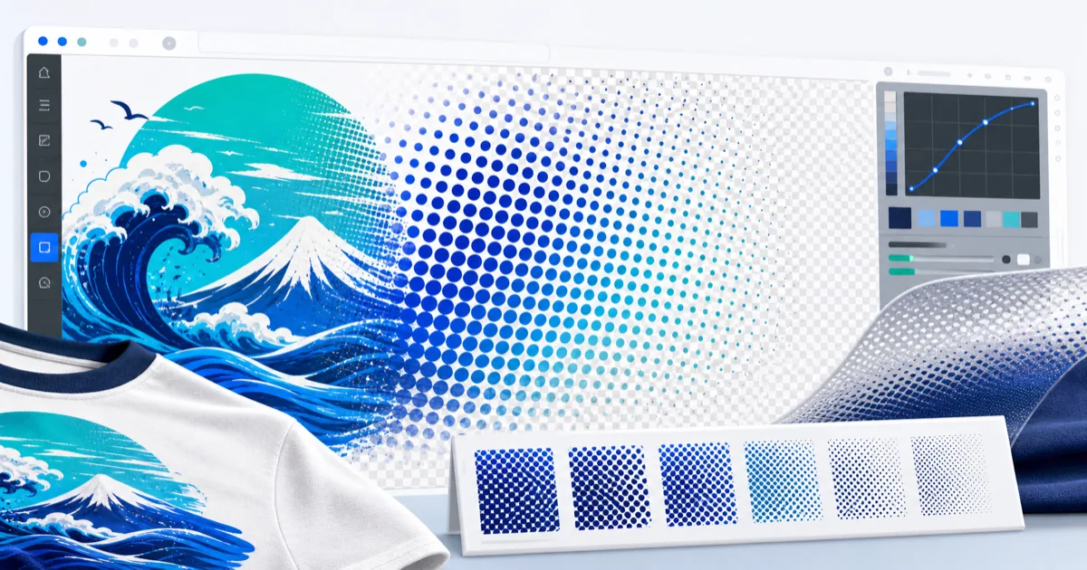
A DTF halftone represents tone with a pattern of dots and transparent gaps instead of one continuous solid area. It can create a screen-print-inspired texture and more garment show-through, but the result depends on final size, dot geometry, printer resolution, ink behavior, powder, curing, and fabric. Always validate settings with a real press test.
What a Halftone Changes
From normal viewing distance, the eye blends small dots into a tonal image. Up close, the transparent spaces remain visible. For DTF artwork, that can be useful for three different goals:
- Open a large solid area to create a different hand feel
- Render fades or tonal artwork as printable dots
- Add an intentional vintage or screen-print-style texture
A halftone is not the same as lowering the opacity of a solid image. Semi-transparent pixels may still create a white-underbase or edge problem depending on the RIP. A production halftone should create deliberate printable dots and deliberate transparent gaps.
Dot Size, LPI, Pixels, and Final Print Size
These terms are related but not interchangeable:
| Term | Meaning | Why it matters |
|---|---|---|
| Pixel | One raster image sample | Determines source detail |
| PPI | Pixels per inch in the placed artwork | Connects pixels to physical size |
| LPI | Halftone lines/cells per inch | Describes screen frequency in traditional halftone terms |
| Dot size | Diameter or grid size of visible dots | Affects openness and print reliability |
| Screen angle | Rotation of the dot grid | Changes visual pattern and possible interference |
DTFBuild offers an Auto dot-grid option plus a manual 0–20 px control and applies a fixed angled grid. Because a pixel value changes physical size when the artwork is resized, set the final output size before judging the pattern.
Step-by-Step: Make a DTF Halftone Online
Step 1: Start With a Clean, Full-Size File
Prepare the artwork at its intended print dimensions. If a 12-inch-wide file is planned at 300 PPI, it should be about 3,600 pixels wide. Remove unwanted backgrounds before applying the halftone.
Step 2: Open the Halftone Mode
Upload the artwork to the DTF Design Editor, choose Halftone, and begin with Auto dot size. Auto is a starting point, not a guarantee for every printer.
Step 3: Compare Dot Sizes
Process several copies with different grid sizes. Smaller dots can preserve more tonal detail but may be less robust in production. Larger dots can be easier to hold but produce a more obvious pattern.
Step 4: Preview at 100% and Actual Size
At 100% zoom, inspect whether dots are distinct and whether thin highlights disappear. At actual size, step back to normal viewing distance and judge whether the tone blends as intended.
Step 5: Export a Transparent PNG
Download the processed PNG and inspect it again on black, white, and the target garment color. The empty areas should be transparent rather than filled with white.
Step 6: Print a Controlled Test Strip
Put 3–5 variants on one small gang sheet, label each setting, and keep every other variable constant. Press them on the intended garment, then compare immediately and after the wash-test schedule used by your shop.
A Practical Test Matrix
| Variant | Dot grid | What to evaluate |
|---|---:|---|
| A | Auto | Baseline tonal balance |
| B | 4 px | Fine detail and dot survival |
| C | 8 px | Midpoint texture and openness |
| D | 12 px | Coarser vintage texture |
| E | 16 px | Maximum visible pattern before detail loss |
The numbers are not universal production recommendations. They are a compact way to find the range that survives your printer, ink, film, powder, cure, press, and garment combination.
Common DTF Halftone Mistakes
Applying the effect before setting print size
Resizing after halftoning changes the physical dot size and can blur the pattern. Size first, halftone second, and avoid resampling afterward.
Making dots too small to survive production
A monitor can display detail the transfer process cannot hold consistently. If dots disappear, merge, or leave isolated adhesive, move to a coarser pattern and test again.
Expecting halftones to repair low-resolution artwork
Halftoning changes tone reproduction; it does not restore missing detail. Fix the source or use the DTF upscaling decision guide first.
Skipping the RIP preview
The exported image is only one stage. Inspect the white channel and final separation in your RIP so the transparent gaps remain open and the dots receive the intended underbase.
Claiming a fixed ink-saving percentage
The theoretical open area of a pattern is not the same as measured shop savings. Actual consumption depends on coverage, white ink settings, RIP behavior, and the artwork. Measure a controlled job before publishing a percentage.
Frequently Asked Questions
Do DTF halftones make a transfer softer?
They can create more open garment area than a comparable solid block, which may change flexibility and perceived hand. The result is not guaranteed because white underbase, ink density, powder, curing, pressing, dot size, and fabric all contribute. Compare labeled samples under the same production settings.
What dot size should I use for DTF halftones?
There is no universal dot size. Start with the tool's Auto setting, then test at least three nearby sizes at the final print dimensions. Choose the smallest pattern that holds reliably while preserving the desired tone after pressing and washing.
What angle should a DTF halftone use?
Angle affects the visual texture and can interact with other screens or device patterns. DTFBuild uses a fixed angled grid for its creative artwork effect. For printer-level separations, follow the RIP and printer manufacturer's settings rather than treating an artwork filter as device screening.
Can I halftone a transparent PNG?
Yes. A transparent PNG is useful because open spaces can remain transparent. Inspect the downloaded alpha channel and the RIP's underbase preview to confirm those gaps were not filled during export, import, or separation.
Is a DTF halftone the same as RIP halftoning?
No. An artwork halftone is a visible design effect baked into the PNG. RIP halftoning is part of converting channels and tones into device output. You may use an artwork effect creatively, but printer-level screening should remain controlled by the RIP workflow.
Test the Pattern, Not Just the Preview
The best DTF halftone is the one that survives your full process and matches the intended look. Create labeled variants in the DTF Design Editor, arrange them with the gang sheet builder, and approve the pressed sample before running customer quantities.
Sources
- Adobe Photoshop: Convert images to Bitmap mode, accessed July 15, 2026 — defines halftone frequency, screen angle, dot shape, and moiré risk.
- Adobe Photoshop: Apply the Color Halftone filter, accessed July 15, 2026 — documents pixel-based dot radius and per-channel screen-angle controls.
- Brother GTXpro support and DTF downloads, accessed July 15, 2026 — official manufacturer page containing the current GTXpro Variable Droplet DTF manual and related printer software.
DTF Build — Free DTF Gang Sheet Builder. Auto-nest designs, export print-ready files. No subscription needed.